Friday, November 25, 2011

Mumtaz Memorial


I was getting bored with the board, so I changed out the Sydney Opera house for this memorial to Mumtaz Mahal. (It has been almost a month for the first display.) This board will take us through December, being on display for just about30 days by the time we break for the holidays.

I was excited to feature the Taj Mahal because it represents a different nationality in our student body (India was the country of study for our middle school students during Global Village Day) and because I just taught the structure to my AP Art History students. Lastly, it was extra cool because I rediscovered these famous landmarks cards, cut from a poster purchased this summer at my trusty standby, French Wal-mart. Less than a dollar for the poster--I love that store!

Wednesday, November 9, 2011

Gorilla, what?

You know that moment, when the students aren't working on their projects. There's even a group clumped together, out of their seats, and they're all off-task.

Kids, get back to work.

But Miss M, Joey drew a gorilla!

Umm what? How did he manage to draw a gorilla? He should be drawing his Modigliani self-portrait...

And then I went to check it out, and, well, he had drawn a gorilla! I mean, in the same way that people find a potato chip shaped like the Virgin Mary or a grilled cheese with the face of Jesus, yes, Joey had in fact managed to accidentally draw a gorilla as he was coloring his neck.

At which point in time, I became the off-task teacher who went to get the camera and document this masterpiece.

Monday, November 7, 2011

A Timely Update


The visual timeline above my board is growing each week. My art history class is now in Byzantium, so we need a few more images, but the timeline is fairly full through Constantine. It has been fun to refer back to the timeline during class lectures. Just today, after looking at Justinian portrayed as semi-divine in the mosaic from San Vitale, I asked if they could remember any other examples from art history where the ruler is portrayed as god-like. To encourage their responses, I pointed them back to the timeline (Palette of Naram-Sin, for example, is on the timeline).


I haven't used it much with my elementary students, though some images from Art is... were the first to populate the line. Still, it seems that my students are noticing the artwork. Last week, during a 5th grade discussion of facial proportions (and later, distortions), one student pointed to the timeline and asked me why the older work was more realistic, more accurate, than the later work (verism vs. the head of Constantine). A great question, and perfect as we looked at the work of Amadeo Modigliani. Why do artists draw things in an unrealistic manner? Is it that they are less skillful? Is it that people back then really looked like that? Or is there something else going on...

Saturday, November 5, 2011

Self-Portraits on Display (again)


Another year has come and gone, and so third grade has once again created collage self-portraits.

The bulletin board last year
was such a hit, both in school and on the web. This year, though, bulletin board aesthetics have been on my mind. I decided to make a slight tweak to last year's display, aligning the work in a perfect grid. I typically go for the sporadic arrangement because it is less work. My perfectionist tendencies would measure and calculate for hours to find a suitable configuration. This year, though, I stumbled upon a brilliant way to align the grid. I am sure many already do this; it must be plastered across website. But since I just this month thought through the process, I thought I would share it.


I was thinking to myself...what if bulletin boards had subtle gridlines, like the back of nice wrapping paper? It would make it so nice to arrange the work. Then I realized---I could create a horizontal center line for myself with yarn! A meter stick, some staples, and I was set. I added an extra staple at the center point of the horizontal line to know where to start with my artwork. I then proceeded to hang the work, eyeballing an equal space from the yarn and from the other work. When all was stapled, I took down the yarn and added the peek-a-boo name tags to guess which student created each self-portrait.

Now that arranging artwork on a grid is so simple, I am sure I will do it more often. I do love clean lines!


Sunday, October 30, 2011

Great Danes!

Do you know the most famous work of art by a Danish person? If you're reasonably familiar with the Danish culture, you might guess that sculpture of the little mermaid by the water somewhere. Nope.

Our school recently focused on four countries as part of our Global Village Day, taking time to learn deeply about four home countries represented in our student body. The student services personnel for elementary mentioned in passing that if I wanted to do any art lessons about Denmark, that would be great. When I finally got around to researching Danish artists, I was quite disappointed. I've studied a lot of art history in college and now teach AP Art History, but none of the names on this list of artists caught my eye. Until I saw the architects.

The Sydney Opera House was designed by a Dane!

This was just the push I needed to implement the "Architecture of the Month" bulletin board that has been floating around in my head for weeks, based on the book 13 Buildings Children Should Know. I pulled facts from the book and from the internet to create a "Did you know?" about the building. It was fun to see the Aussies at our school respond to their board, proud of their featured building. At the same time, it was great to highlight the design of Jorn Utzon, an architect from Denmark whose design beat out 232 other entries and became the iconic building of Australia.


The board is not my favorite design ever. I tried to create a design that could be updated monthly without much effort. Change out the facts, replace the building, and it's set. My TA did a fabulous job drawing the building, though it seems like it needs something more in that space. I intentionally kept that space large to focus on the building and accommodate for future buildings that might be more vertical in design, but I might tweak it in future months.


Just as I was finishing the display, two moms walked down the hallway, busy preparing Global Village Day lunch.

An Aussie and a Dane.

Saturday, October 22, 2011

Family Portraits


I just came back from Shanghai (again) with (more) ideas and (more) connections---attended the ARARTE conference that some art teachers told me about during my first trip to Shanghai back in March. I am excited to get involved with ARARTE and explore ideas from the conference, but I'm still riding high from my first trip. This second grade project comes from Art Is Messy, who graciously welcomed me into her classroom and took me around her school.


Similar to the fourth grade field trip, my students started by looking at an assortment of family portraits. They had to write a sentence about each artwork answering the questions who and where. Next, they sketched two ideas for their own family portrait, accompanied by sentences that told me who and where. The following week, students selected their favorite idea to transfer onto the good paper. A few students found the need to sketch a third idea, like this family portrait on the beach (finished work at the top).


Pencil lines were traced in permanent marker, then the crayon/watercolor experimenting began. My students as a whole are fairly new to watercolors. In the past three years, I've done many resist projects, particularly with oil pastels, but very few watercolor mixing projects. Timing of the project couldn't have been better. Right before the kids started painting, I attended a conference in Beijing (truly, it's been a month of conferences) and learned some great tips from an art teacher working at a school in Guam, including watercolor procedures. We woke up our trays of Prang watercolor with a drop of water, then moved paint onto the palette (lid), even if we weren't mixing, though I really encouraged special mixed colors. We tested each color and various painting techniques on scrap paper because we couldn't erase watercolor. The students watched me make mistakes, painting a black road, then trying to paint the yellow line down the center and watching it bleed, or as we called it, travel. We brainstormed ways to avoid such traveling, such as doing the yellow in crayon first or letting the black dry. As we learned, traveling is not a bad thing, but you need to be in control. Use traveling in trees, grass, sky, ocean, sand---but don't let hair colors travel into skin colors! That makes a muddy mess.

At first, I was a little disappointed by the scale of the people in the finished results. Many of the works function more as landscapes rather than portraits. I wondered if I should have given more direction as to the size of the people, but ultimately decided it was not an issue. The objectives were to tell who (portrait) and where (landscape), plan a project, and explore watercolor. I did not give any instruction about how to draw the figures of their family, and most students preferred to develop their environment rather than the people. So whether their family was on the beach, playing hide and seek, riding horses, or in outer space, the students enjoyed using watercolors and crayons to develop the story of their family portrait. They are excited to do more with watercolors and best, I'm encouraged to give more time to the medium in my classroom!


Tuesday, September 20, 2011

Fourth Grade Field Trip


My fourth graders took a field trip.

To introduce a landscape project, we analyzed different examples of landscapes from art history. I selected eight examples of landscapes from my art prints, some western, some eastern, and some folk art. To display, I clipped the pieces along this tension line, made by IKEA for curtains. (The line was installed last fall and typically shows secondary work, the hallway is next to the secondary art room.)

We discussed vocabulary and went through the worksheet questions with an example, then quietly made our way up the stairs to our private museum. The students walked around with a clipboard, choosing to write about four of the eight pictures. After I checked their work, they were allowed to free draw until everyone was done.

Lastly, we sat around a few images and talked about techniques artists use to tell us what is close in a picture and what is far away.

The worksheet was a great tie-in to language arts. Approximately 85% of my students are non-native English speakers, so I like to emphasize all vocabulary (not just art terms) and other language arts concepts whenever possible (like the art-making/writing process).


Worksheet Prompts

     Foreground Nouns:
     Background Nouns:
     Sky Adjectives:
     Landscape Verbs:
     Where is this place?


I was very pleased with the lesson results. The change of location and the change of activity was enough to keep the students quietly engaged in the process. It was great to use parts of speech as a starting block for looking closely at art. At the end, as students shared their answers for nouns in the foreground and background, I challenged how they knew certain things were close. The students did a marvelous job putting words to their observations, noting things like size, overlapping, placement, and details.


Some of my students were too smart for their own good. My prints are labeled, including the museum that currently owns the piece. Noticing the place names, some of my students copied those locations instead of guessing the place the artist was representing. Henri Rousseau's jungle paintings were definitely not a painting of London...I got a chuckle out of such responses, then explained it to the students and asked them to guess another location.

Thursday, September 8, 2011

Design Challenge

Just over a year ago, the art department purchased a DSLR. Yet it was only last week that I discovered I could now take pictures of my whole bulletin board straight on---not at an angle from down the hall! Guess I should have tried that sooner. The hall was too narrow for my old point and click, and while there's some curvature to these pictures, I'll take it any day over the demonstration of one-point perspective in my previous bulletin board pictures.

This project was based on a design challenge seen at the Briargrove Elementary Art Page. My students could only use our school initials, ISQ, to create an interesting composition. We talked about how to create variety with only three elements through repeating, enlarging, overlapping, cropping, and tilting. We also discussed thick and thin lines, along with dark and light value.

The students did a great job with their one-class-period project. It was great to see them overcome challenges and limitations. I love projects that require them to think creatively!


One table of students decided to join their pictures together to create a larger letter "I." I had to place it sideways on the bulletin board due to space, but it was fun to see them initiate the collaboration and work through the problems it presented. Scroll back up to see their work!

Sunday, August 28, 2011

In Situ

The poster is here!

It arrived on my second day of art classes (fifth day of school) and is perfect for the space. The first few art classes learned about the expectations by looking at a digital copy on my TV. It was great to see their excited faces when the walked into art this week and were greeted by the large poster.

As you can see, I decided to move the character traits for each month to the engaged column/support piece to the right of the poster.

In the past, this space was empty or contained random funny pictures of myself and the music teacher. Now the character traits have a new home and the column has a purpose, which freed up the space above my board for...


an art history timeline! I know you can buy pre-made timelines, but (personal opinion) they're ugly. Please send me a link to one that is visually appealing and able to be understood by students sitting in the back of the room. (I don't actually have any pre-made poster in my room. I custom-make everything either by hand or have it printed locally from my graphic design. I'm just too picky!) So I've never had a timeline before, nor have I ever wanted one. (Two years ago, when I taught AP Art History for the first time, I didn't use my classroom, otherwise I might have thought about having a timeline then...)

Right now, the timeline is fairly empty. I placed a few familiar images from the book Art is... along the timeline, since all my students read the book on the first day of class. I also added four images from Mesopotamia that we studied in detail in AP Art History. On Monday, we begin Egypt, so we will start to incorporate those along the timeline. As various elementary classes look to art of the past, I will also add those images to our chronology.

I messed with the scale, labeling every 45 cm but changing the time increments (jumping large amounts of time for ancient art and making more divisions for recent time periods).

You can see the artmaking process posters to the right of my board, next to the TV. If you look carefully, you'll notice a new purple poster to the left of the board. I was inspired by different art blogs and pinterest pins to create an "I'm done. Now what?" display. My sketchbook this year has various extra-time activities. With this new display, I can change out the options each class, giving the choice of up to three different activities (free draw, free read, artist statement, my artist list, drawing squares, coloring pages, etc.).

Right now, I'm addicted to fonts, especially new ones from dafont.com and Kimberly Geswein. She's a friend of a friend and worked at one of our sister schools. I'd take up her offer to make my handwriting into a font if I actually liked my handwriting...but I don't. One of the reasons I print everything with fun fonts.

Another reason I love creating my art displays digitally---being able to mix and match fonts! Some favorites are Grobold, Aubrey, Bauhaus 93, Broadway BT, Designer Notes, Paper Cutout, Complete in Him, and Loved by the King. Plus, I've loved Avant Garde and Century Gothic for a few years now.

But the mixing of fonts, my recent obsession.


Saturday, August 27, 2011

Art is...

Ever get a GREAT idea, only to find out you're not the first one to think of it?

I recently taught about Western art education to a group of local Chinese teachers. A post for another time. I stressed the importance of problem-solving, critical thinking, and originality in art, not copying the teacher. There's much more to be said about this training, but I told the teachers about a Saturday morning cartoon that I will never forget. It was a little blurb from Aladdin's Genie challenging the idea that great minds think alike. Instead, he would change the phrase to great minds think for themselves.

So while I don't think my ideas are that unique, amazing, or original, I still pride myself in thinking for myself. Something about American values of individualism and charting your own path that has been engrained into my person from my upbringing, including Saturday morning cartoons. Sure, I'm inspired by everything in life, but I'm less likely to copy a lesson, bulletin board, or activity exactly. And a lot of my ideas, they come from my own mind, combining various things I've seen online, in books, at another school, or completely unrelated to art education. Yet over and over I see that there is nothing new under the sun.

In my first year of teaching, my friend Miss Emily told me about her third grade painting lesson, based on the artwork of Wayne Thiebaud. I'm not sure where she got her idea, but between my first and second weeks of teaching the project, I found an almost identical lesson in a six year old copy of School Arts magazine!

Now this year, I was so excited by an idea that came to me in the middle of my first art class. Less than 24 hours later, saw it on a list of 20 Creative Bulletin Board Ideas for Art Teachers. So I guess it's not original, but it was a great first day of art class activity.


For all my classes, except for that first group of 5th graders, I welcomed them to the art room, then passed out a piece of paper, cut hotdog-style, that had "Art is" printed on it. The students could finish the sentence any way, with as many or few words as they needed, and decorating however they saw fit with crayons, markers, and colored pencils. After they worked for a while, I let students share their sentences, followed by reading the book 
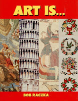
Art Is... by Bob Raczka. (I turned the book into a Prezi to make it easier for the students to see the pictures.) We then went over art class expectations and created namecards for my job pockets.

To display the work, I created a custom-border with the lines from the book.


I love their answers.  One boy wanted a second piece of paper and attached his two answers. 
"Art is droling (drawing). 
Art is lerneing (learning)."


Of course, art is fun, fun, fun, fun, and funny.

But did you also know it's boenqshrs?

It is also: amazing, magical, a great subject, my favorite subject, good, bad, cool, nothing, fear, difficult to me, even fun, color, drawing magic, beautiful, creative, fantastic, unusual, great, pretty, perfect, m&m...

Finally, as the book says,
"Art is how artists get you to think."


So the moral of the story: Think for yourself, realizing that someone else probably already thought of it. But it's about the process, not the product, so still do the thinking.


boenqshrs is 1st grade spelling and mirroring of letters for doing (boen) pictures (qshrs).


Friday, August 26, 2011

It's a Dry Erase Miracle!


I stumbled across a new art teacher supply this summer.

Back in the spring, my mom e-mailed me about a great sale on Crayola products. Not knowing what would be in stock at the local arts and crafts store, I sent her a dream list compiled from Crayola's website. I had never heard of Dry Erase Crayons but thought they would be neat to try.

I think I am in love.


I demonstrate many art skills on the whiteboard directly, but cannot model value changes due to pressure and layers. While I absolutely hate using chalkboards, I hear that's one thing they were good for...


So art teacher, meet Crayola Dry Erase Crayon. It comes in standard colors and brights (works on whiteboards or black dry erase boards). And just to show the value changes possible, I made a quick shaded sphere for you. I also demonstrated the standard green next to the bright green, then two oranges and two purples.

Thus far, a little elbow grease and a soft cloth has been all that's needed to get erase the crayon.


Mr. E recently blogged about another use of the crayons---a lesson with aluminum foil. 

But for now, I am content to be able to demonstrate creating value with pressure and/or layering on my whiteboard!

And as for you, run, don't walk, to your nearest arts and crafts store to pick up a teacher box of these crayons. If you have the time, energy, and ideas, consider picking up more for your class, but at least buy yourself a set for demonstrations...

Thursday, August 18, 2011

Q-tips, Soap Dish, and a Vegetable Strainer

Carrefour (french Wal-mart) is my favorite school shopping location. Sure, they don't have any actual art supplies. The department TA gets most of those from the art store in another part of town.*

But wandering the aisles of Carrefour (as long as it's not Sunday afternoon) is just so much fun!


Carrefour is my main source of plastic containers.

It began in my first year when I spotted these strainers. The colors caught my attention, as my tables are labeled red, yellow and blue. I picked up a few, and then continued to buy more over the years. Round, small rectangles, large rectangles (perfect for A4 paper), two-layer trays. As my teaching progressed, I found myself sorting some supplies into warm, cool, and neutral. The red containers became perfect for the warm paper scraps, blue for the cool, and yellow was the closest to neutral.


Over time, I've collected Great Lakes juice bottles, Skippy peanut butter jars, and illy coffee cans to hold other supplies. Free containers for the art department, and further justification of my daily orange juice ritual.  You can see that some of the containers are extra colorful.  The Great Lakes rectangular juice bottles are my favorite water containers.  They hold enough water for two students to use without changing water during class.  The shape is very stable and never tips.  The ridges in the corners also provide a great texture to help loosen paint from the brushes.

While I love these containers, I recently wandered Carrefour looking for something to hold crayons. These containers are too tall, making them impractical for crayons and little hands.


I first spotted soap dishes and noticed the similarity between the lid and a crayon box. (I also had a regular size crayon and large size crayon in my purse to confirm sizes.)

At $.50 each, I bought 10 for crayons. I also picked up some new spongebobs. After three years, they were looking a little worse for wear and I was a few short in the larger classes.


When I was unpacking the items in the classroom, I realized that the soap dish lids were the perfect size for spongebob! In the meantime, I'd also noticed that my Chinese Q-tips came in the cutest little transparent plastic container that seemed like they were meant for crayons. So bring on another trip to Carrefour and 20 more soap dishes. And, well, two different brands of Q-tips had two different size plastic containers---same height, different diameters---so I had to get 12 of each. And now I have great little cups of crayons and thousands of Q-tips in two large plastic bags.


*The art store is half the size of the average convenience store in the states, or smaller, and packed floor to ceiling with high school, college, and professional level materials. Acrylic, oil, tube watercolors---but no tempera. Absolutely no Crayola products, but they do stock Prismacolor Markers. Colored pencils, oil pastels, but no crayons. My markers and crayons are imported. And if you had any thoughts about crafty stuff, like pipe cleaners, pop poms, and tacky glue---nope. Just the basics. We have to run around town to many other stores to find all the random supplies I want.

Search This Blog

Total Pageviews


  © Blogger template Shush by Ourblogtemplates.com 2009

Back to TOP